
Images are most estates' byte majority and their most automatable win: modern formats cut sizes by half or more, edge transformation services mint the right variant per device on demand, and the whole pipeline runs from URL parameters. This guide assembles the system — format ladder, variant URLs, responsive sizing, variant-space caching — and the cost metering that keeps it from surprising you.
The format ladder
Modern image delivery negotiates down a ladder: AVIF where the client supports it (typically the smallest at comparable quality), WebP as the broadly-supported middle, JPEG/PNG as the universal floor — with the choice made per request from the Accept header, not baked into your markup. Every serious image service and CDN image add-on automates exactly this ("auto format"), which is the right way to consume it: hand the service your originals, let negotiation pick the format, and keep one URL per image in your templates. Two boundary notes: keep originals in a lossless or high-quality master form so re-encoding generations don't compound, and leave already-optimal assets (SVG icons, tiny PNGs) out of the pipeline — the ladder is for photographic and complex raster content, where the 40–70% savings live.
Variants from URLs, not from designers
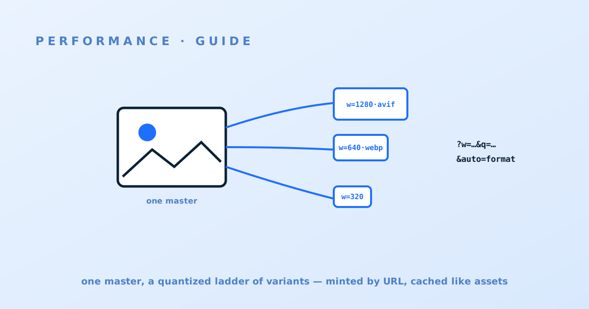
The operational transformation is moving variant creation from the asset pipeline to the request path: one master image, with size, crop, format and quality expressed as URL parameters (/img/hero.jpg?w=800&q=75&auto=format) and minted on demand by the edge or image service, then cached. This deletes the pre-generate-every-size build step, makes new size requirements a template edit, and means design changes never re-run a batch job. The discipline it demands: parameter hygiene — quantize widths to a fixed ladder (e.g. 320/640/960/1280/1920) rather than letting arbitrary values through, clamp quality to a small set, and reject unknown parameters — because every distinct parameter combination is a stored variant and a transformation charge, and an unquantized width parameter is an unbounded bill. The platforms differ meaningfully in pricing model and capability here; the image platform four-way and the CDN add-ons comparison map the field.
Responsive sizing: stop shipping desktop pixels
Format savings are routinely dwarfed by sizing waste: a 1920-pixel hero downloaded by a 390-pixel phone ships 10–20× the needed pixels regardless of format. The fix is standard HTML doing its job against your variant URLs: srcset with the width ladder and sizes describing layout, letting the browser pick the smallest sufficient variant; <picture> only where art direction genuinely changes the crop. Add loading="lazy" on below-the-fold images and explicit width/height (or CSS aspect-ratio) everywhere to keep layout stable. The audit that finds the waste: from RUM or logs, compare delivered image widths against viewport widths per pageview — the estates that have never looked typically find the majority of image bytes were resolution the screen threw away. This section is pure template work against the variant system from section two; it's also where the mobile-market payload discipline from the regional surveys gets implemented.
Caching the variant space
The variant system multiplies cacheable objects — one master × formats × widths × qualities — and the cache design keeps the multiplication honest. The variant parameters belong in the cache key (they select content — the cache-key rules apply squarely), which is exactly why quantization matters: a five-step width ladder times three formats is fifteen well-reused entries per image; arbitrary widths are infinite entries used once. Format negotiation caches via normalized Accept handling (the same machinery as compression variants) rather than raw-header Vary. TTLs run long — variants derive from versioned or stable masters, so give them the near-immutable treatment, and on master replacement purge by the master's tag so all variants fall together, per the purge guide. One platform question to settle: whether transformed variants are cached network-wide or per-POP/regionally — it changes both latency and how many times you pay the transformation.
Metering and the build-vs-buy line
Image services meter differently enough to reorder the choice for a given estate — per-transformation, per-source-image, credit-blends, bandwidth-inclusive — and the multiplication from sections two and three is precisely what gets metered, so model your variant space against each candidate's meter before committing (the comparisons above carry verified pricing shapes; your TCO worksheet gets an images line). The build-vs-buy line falls out of scale and shape: a CDN's bundled image add-on covers most estates cheaply; a dedicated image platform earns its price where images are the product (catalogs, media, UGC) and DAM features, advanced enhancement or heavy transformation volume matter; self-hosting the transform tier (sharp/libvips behind your own cache) makes sense at large volume with engineering appetite — the same honest arithmetic as the DIY comparison, including the payroll line. Whichever tier you pick, the system above is identical; only the meter changes.